This post deals with the philosophy of correlation and general statistical inference methods, my heavily biased opinions towards observational science and sickness associated with inferential methods. Then it is followed by some practical exercises on correlation, then some simulation follows and we try to see how robust correlation is to noise.
Correlation as I recently discovered is one of the corner-stone methods of statistical analysis as applied to biological sciences. Frequently I've come across papers that analyze high-throughput data to find a correlation between two apparently un-related sets of observations that were made and soon enough the paper is only filled with statements of correlation 0.6 P-value 10^-31 and so on. Towards the discussion, the authors try to explain some of the correlation in terms of some biological facts but I always had this feeling of dissatisfaction after reading such papers because I felt like I didn't really find out something amazing or new even after ploughing through it. To be honest I found such papers boring. It was more fascinating to read about how they had tracked the motion of the ATP motor using a microscope than to read about hypothetical relations between sets of numbers obtained from experimental observation. It was only much later that I tried to find out what the whole deal with having a hypothesis was and why the question preceded the experimental techniques or the other way round, that I ended up finding out why.
Science, as it is done today follows two different philosophies. One is the old philosophy which had its roots in the way statistics was developed, called "hypothesis driven research". It involved posing a question initially which postulated an association between two previously-thought-to-be-un-related phenomena. This had to be done in quite a round-about way by framing it in the form of a "null hypothesis". So, if in your mind you had a feeling that the two phenomena were related, for the purposes of statistical analysis you have to think in the opposite way i.e. the phenomena are not related which becomes the null hypothesis (it isn't your hypothesis so you can't prove the null hypothesis; the theory that the phenomena aren't related). The alternate hypothesis is your hypothesis and essentially you have to come up with enough evidence to prove that the null hypothesis is incorrect. You cannot prove that your hypothesis (the alternative) is correct either. All you can do is prove that the null hypothesis is incorrect (with a certain probability that you might be wrong: the P-value) and that the two phenomena are related.
In my humble opinion, that is just a strange and weird way of doing it and unfortunately very confusing until you get used to it. In fact, the Bayesian school of thought teaches exactly the opposite. More on that much later. Now, the most common way to detect associations in statistics is the correlation metric.
The correlation metric measures the degree of linear association between two sets of numbers, in your case these two sets are experimental observations where one set is the numerical change in perturbation and the second set is the numerical output of the perturbed system or the observations. The value of correlation is scaled between -1 to 1 where numbers between 0~1 indicate positive correlation and between -1to 0 is a negative correlation. Positive correlation states that as the level of perturbation goes up the experimentally observed output of the system goes up. Negative correlation states the opposite.
Non-linear associations are not detected by the standard form of correlation that I'm discussing here called the Pearson correlation after Karl Pearson who created it. Non-linear associations exist in nature and their detection is done using other metrics like mutual information. An alternative way to detect non-linear trends using Pearson correlation is to convert all the numbers in your random variables X and Y to ranks and then do a Pearson correlation on these ranks. This alternative method of calculating correlation is called Spearman correlation. For linearly related numbers, Pearson and Spearman correlation will give the same value.
Practicals:
So correlation can be used to find if there is a linear trend between two sets of numbers. So if you were to construct a linearly related pair of number sets like
x<-seq(0,1,by=0.01)
y= 2*x + 40
plot(x,y,col="red")
cor(x,y)
Now even though the value of y is 2 times X and shifted by the number 40 it is still linearly related to the original set of numbers in X by the linear form (y=m.x+c). So the correlation is perfect and comes to a value of 1.
Now the numbers don't have to necessarily be in any sorted order to calculate correlation lest this example mislead you. You can re-order the numbers as long as you preserve the one-to-one relation between x and y and you will get the same correlation value.
y_shuffle<-sample(y)
y_order<-match(y_shuffle, y)
So now that Y is shuffled but X is still the same you might get a terrible correlation (not 1) because the values have been all shuffled up. To check
cor(x,y_shuffle)
But if you shuffle X the same way you shuffled Y you can test the correlation between them and it should be the same as when the two sets were ordered.
x<-x[y_order]
cor(x,y)
That should have given you the same correlation as in the previous calculation.
Now correlation decreases when the points are moved away from the straight line that would pass through them. To see how that happens, you can try to scatter the points a bit by using some uniformly generated noise and add it to the data.
x<-seq(0,10,by=0.1)
y=3*x+20
cor(x,y)
# the correlation is 1
plot(x,y,type="b") # dead straight set of points
plot(x,y+runif(length(y),-0.2,0.2),col="purple",main="Scattering a line uniformly") # they get scattered a little randomly along the line

The correlation for this set of points is 0.9999173 which is really close to one, (your result will be different because we are using random numbers), by increasing the noise applied we can eventually destroy any semblance of correlation, but first we are going to explore this interesting concept I just thought of while writing now. What is the variation of the correlation when the same amount of noise is added to it. Since the noise we are adding is the same (-0.2, 0.2) we will get correlation values that are clustered closely, but what is the distribution of that clustering?
To check that, we will repeatedly calculate the correlation between x and y after scattering y with the same amount of uniformly distributed noise (-0.2, 0.2). After accumulating all these correlations into a vector, we'll plot a histogram or density plot in this case.
cor_dist<-vector()
for(i in 1:5000){
cor_dist<-c(cor_dist,cor(x,y+runif(length(y),-0.2,0.2)))
}
plot(density(cor_dist),type="h",col="red",main="Density plot of Correlation Scatter",xlab="Correlation Values")
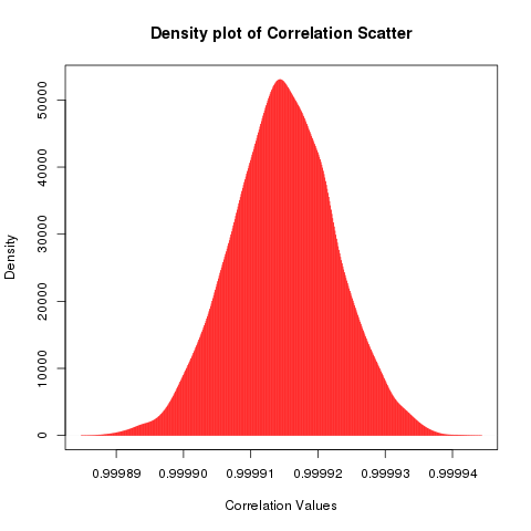
While one might be tempted to call this a bell curve or a normal distribution, it might be prudent to see the asymmetry on the right hand side of the distribution. Does that look like a slightly heavier tail? maybe.
You can test for normality using the Shapiro-Wilks test or the Kolmogorov-Smirnov test using.
shapiro.test(cor_dist)
One can also visualize normality using a qqplot which is a quantile-quantile plot that seeks to match a theoretical distribution against the distribution of the supplied data and find deviations from the straight line if any.
qqnorm(cor_dist,pch="*",col="purple")

Ok, we'll leave this for later, let's start to see how much is correlation destroyed with increasing amount of noise and scattering away from the straight line.
First we will do this the raw way, we'll add uniformly distributed noise to the intercept of our linear model and this noise will be added stochastically so the degradation of correlation may not be monotonic, in the next exercise we'll make it a little more deterministic by expressing the noise as a percentage of the original value. After some optimization I've realized that it is better to add the noise exponentially to be able to see how fast correlation degrades
x1=x
noise=2^(1:16) # we will use runif to add scatter symmetrically (negative and positive) with number limits defined from this vector
noisyline<-sapply(noise,function(x){return(y+runif(length(x1),-(x/2),(x/2)))}) # So we pick exponential increasing ranges of value for noise and add it to the perfectly correlated variable and generate noisy Y values
noise_cor<-sapply(noise,function(x){return(cor(x1,y+runif(length(x1),-(x/2),(x/2))))}) # Now we calculate correlation for each x y set as y is destroyed by uniformly distributed noise that increases exponentially
#Plotting the files out to see how correlation changes with noise
# The scatterplot
for(i in 1:16){
png(paste("corrpoint",i,".png",sep=""))
plot(x1,noisyline[,i],col="blue",main="Noising up a Perfect Correlation")
dev.off()
}
# The correlation value
for(i in 1:16){
png(paste("corrpoint",i,".png",sep=""),width=700)
par(mfrow=c(1,2))
plot(x1,noisyline[,i],col="blue",main="Noising up a Perfect Correlation",xlab="X= 0 to 10,in steps of 0.01",ylab="Y= (3*X+20) + Noise")
plot(noise_cor[1:i],col="purple",main="Correlation decline on Noising",xlim=c(1,16),ylim=c(-0.5,1),type="b",xlab="Noising Iteration in Powers of 2",ylab="Correlation")
dev.off()}

So based on simulations, you can see a couple of things. For a small amount of noise the correlation metric does not fall drastically and then as the noise keeps increasing (exponentially) the correlation begins to fall in a steep slope to zero remaining robust up to 2^6 which is 64 which for y=3*x+20 where x=6 gives 38 which for the noise 64 added as x/2 gives a symmetrical -32 to +32 noise. So noising comparable to the values of the original numbers can result in correlation getting degraded which seems intuitive.
However what is interesting is when the points begin to scatter so much that it is pretty much a random scatter. At that point correlation begins to oscillate, 0.2 and lesser correlation can arise out of random scatter of perfectly correlated points to begin with. This calls for an introspection in terms of what value of correlation do we consider significant enough to point to a linear trend in the numbers that we are looking at. It is always good to eyeball the scatterplot rather than just blindly trusting the correlation value. For the purposes of publication however there are quantitative methods of establishing the significance testing for correlation. Significance is done using Permutation testing which we will look at in another post.
This post was long and it was just as hard for me to write it as it is for you to read. Take it slow and easy and try to understand what happens in the code and look at the graphs to see how you can also spot the correlation between a set of points by looking at how they are spread around the centre of the diagonal on a scatter-plot. When they are spread all over the place then the correlation is quite close to zero. However you will be surprised by how variations of the same number of data-points can give the same correlation or how certain regular shapes can have very little correlation. It sort of teaches you that a regularity or a symmetry in shape may not necessarily be grounds for a correlation but a symmetry around the diagonal of the scatterplot certainly is.

