Understanding the T-test
The T-test is a frequently used statistical test for testing the difference of means between two groups. However as these things go, people don't really seem to understand how it works so I've written some intuitive simulations in R that may explain it better.
requires: R, install.packages("corrplot")
The T-test statistic is designed to help you determine if the difference of means (average) between two groups of numbers is sufficiently different to be called significant. You see such a situation in life when it is reported, for example, that the average marks of a class has improved from 65 to 70 which is reported as an improvement.
If you are familiar with the properties of the mean you will know that it is influenced by the value of a few outliers (large values) and also it does not tell you anything about the spread of values around it.
The statistic that tells you about the spread of values is the variance. The variance is calculated by subtracting the mean from every observation and squaring these calculated values and finally adding all the squared values into one lumped value and then dividing by the number of observations.
So, the mean alone cannot tell you whether the difference in the control and test group is sufficiently different enough to make the claim that there is an effect or an improvement. To illustrate that look at the graphs below.

So the mean difference in the above figures is the same, it is -1.5 - 1.5 which is 3, but the variance (spread of the values around the mean) varies all the way from 0.5 to 7. As you can clearly see, more variance produces more overlap in between the two histograms such that even if the means are different, it is hard to say that overall, the scores between the two groups can be neatly divided into two groups. In the first tile of the graph you can say that it seems the groups separate neatly into two so the difference in means can be considered to be representative of the difference of the two groups as a whole. However in the last tile even though the difference of means is the same, the spread and overlap of the values shows that random fluctuations in the scores could switch scores from the first group into the second group or vice-versa thereby not enabling a clear differentiation.
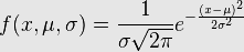
So the T-test addresses precisely this issue. By taking
both the mean and the variance into account it combines them to produce a
statistic which looks like a cousin of the Signal to Noise Ratio (SNR)
So X1 is the mean of the first group, X2 is the mean of the second group, S1 & S2 are standard deviations of the first and second group respectively and N1 and N2 are the number of observations in both the groups.
Calculating the t-statistic with the values gives us a variable which follows what is known as the t-distribution. As an aside, I should probably mention that one of the major objectives of mathematical statistics is to reduce a bunch of numbers using a certain formula called the test-statistic. This reduction (under certain assumptions) causes the properties of the statistic to follow a certain distribution with predictable shape and size which can then be used to estimate the probability of that statistic being that high by chance.
So we will be looking at the T-distribution and T-test from a simulation perspective in R
mx=seq(-10, 10,by=0.5) #
my=seq(-10, 10,by=0.5) #create an evenly spaced set of means
#using each of those means, draw from a normal distribution of that mean
# and standard deviation of 3
simx<-sapply(mx,function(x){rnorm(150,mean=x,sd=3)})
simy<-sapply(my,function(x){rnorm(150,mean=x,sd=3)})
# a function to calculate the t-statistic of two vectors
t_stat<-function(x,y){
ts<- (mean(x)-mean(y))/sqrt((var(x)/length(x))+(var(y)/length(y)))
return(ts)}
# Now simx and simy are two matrices the columns of which consist of 150 numbers which are normally distributed with the mean taken from each element of mx and my which vary in steps of 0.5 from -10 to 10
# now we take each pair of vectors that can be made by matching the 1st column of simx to every column of simy and then moving on to the 2nd column of simx and matching it to every column of simy and so on till all pairs are constructed. These pairs of vectors will be sent to t_stat to compute the t-statistics for the pair. That t-statistic will be stored in a matrix which we will visualize to see how the value of the t-statistic changes as we keep varying the two means.
t_mat<-matrix(0,41,41)
rownames(t_mat)<-mx
colnames(t_mat)<-my
for(i in 1:dim(simx)[2]){
for(j in 1:dim(simy)[2]){
t_mat[i,j]<-t_stat(simx[,i],simy[,j])
}
}
library(corrplot)
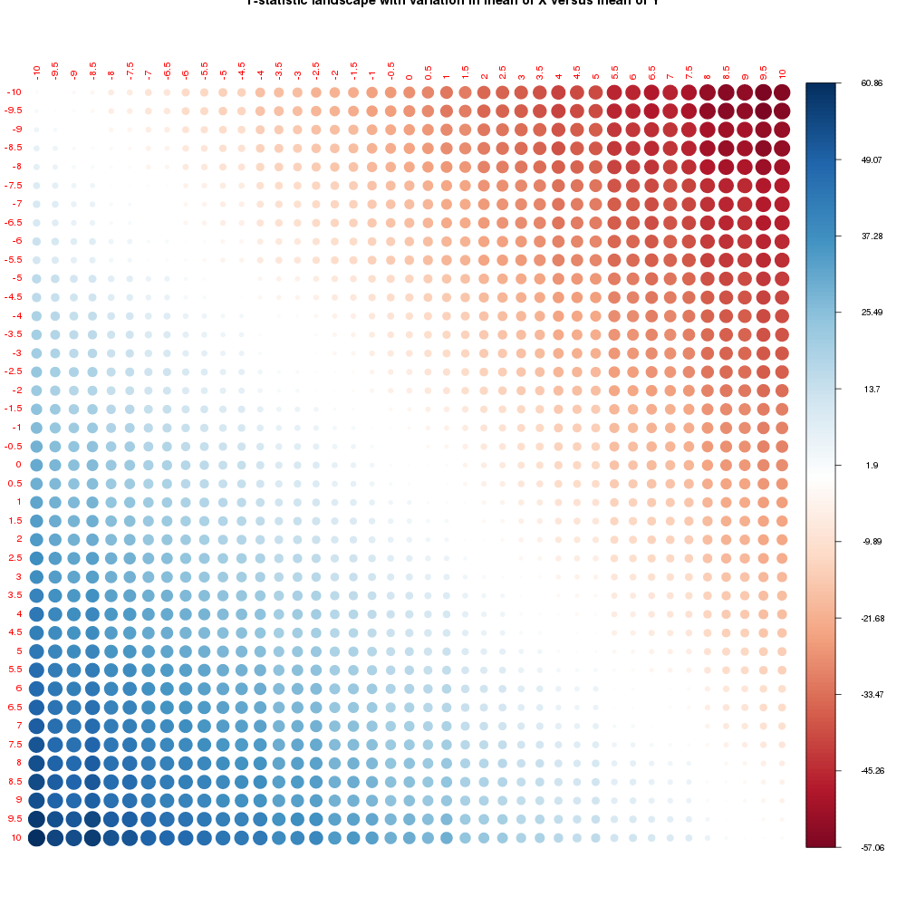
corrplot(t_mat,is.corr=FALSE, addgrid.col=FALSE,tl.cex=0.6,main="T-statistic landscape with variation in mean of X versus mean of Y")
From this image it is clearly visible that the t-statistic increases as the difference in means increases in either direction only changing the sign. The matrix looks symmetric as it theoretically should be but close observation will show asymmetry. That is because we used two sets of random draws to generate our distributions with the same mean and since we sampled only 150 numbers we are not really guaranteed convergence towards the ideal means that we specified for the random draws. But for all practical purposes the matrix is symmetric.
The heat of the colours shows the value of the t-statistic as mapped to the colour bar on the right. So along the principal diagonal since the difference in means is not much the t-statistic goes to zero.
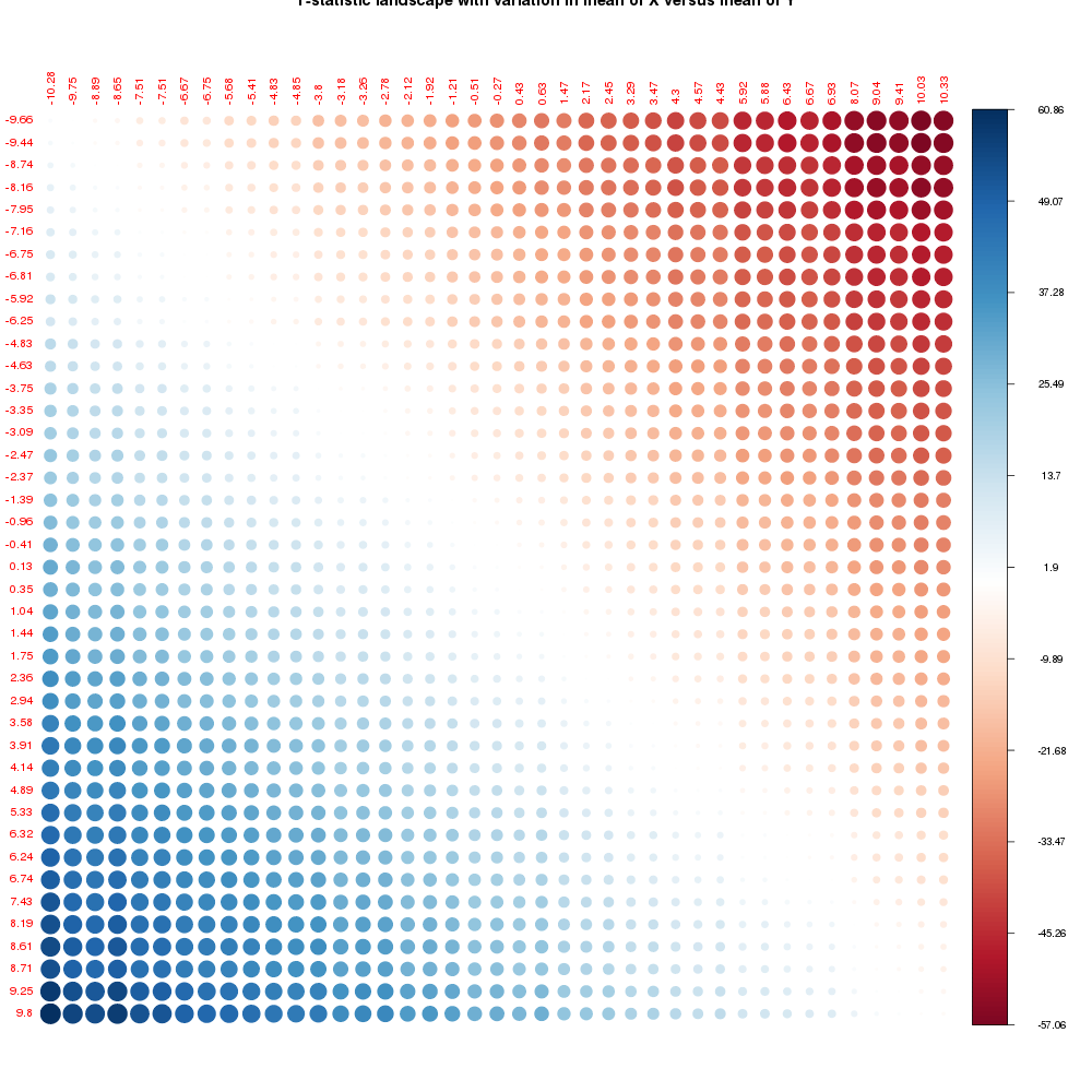
Just so you trust me on this, we'll calculate the actual means of our simulated data and plot it to make sure
amx<-apply(simx, 2, mean)
amy<-apply(simy, 2, mean)
rownames(t_mat)<-round(amx,2)
colnames(t_mat)<-round(amy,2)
corrplot(t_mat,is.corr=FALSE, addgrid.col=FALSE,tl.cex=0.6,main="T-statistic landscape with variation in mean of X versus mean of Y")
So now you can see that there are minor variations in the actual values of the means of the distributions that were sampled from the normal distribution using the means that we specified from -10 to 10 in steps of 0.5
Anyway now we need to know the p-value that is associated with the t-statistic.
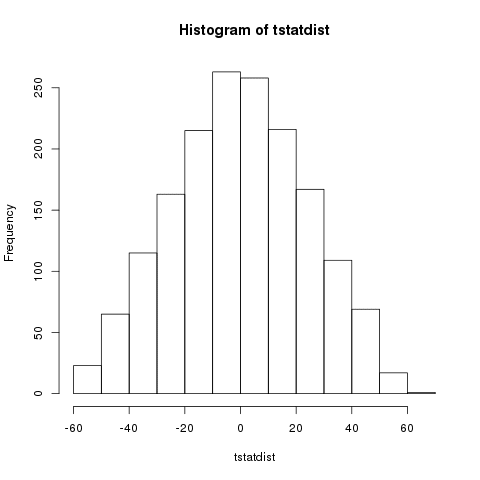
The p-value is calculated from the t-distribution, in our case we can visualize this distribution by plotting the t-statistics that we have calculated as a histogram.
tstatdist<-as.vector(t_mat)
hist(tstatdist)
Slightly heavy tailed if you look carefully. the point is that if you increased the number of samples from 150 to say 1000, you would have got a distribution that was asymptotically converging to the t-distribution. You can do that by changing the call in rnorm to 1000 from 150.
So the way to calculate the p-value is to calculate the area under the curve from the LHS of the curve from minus infinity to the point where the value of your t-statistic lies. This area is subtracted from 1 to get the p-value. (Since the AUC of a probability distribution always sums up to 1)
You can do that roughly (I mean very very roughly) by using the histogram binning data to approximate a probability distribution function and using a cumulative sum with normalization by the total sum to obtain an approximate (very approximate) numerical integration of the area under the curve.
tstathist<-hist(tstatdist)
csumtstathist<-cumsum(10 * tstathist$counts)
plot(csumtstathist, type="l") # approximate cumulative distribution function
csumtstathist/max(csumtstathist)