In this post will you see, a tangled explanation of the Monte Carlo simulation procedure, finding the value of pi using a geometric concept where area and probability have a relation. Then follows the concept of computing the standard error to estimate the variability created by errors in measurement (or maybe that will be another post).
Pi is the ratio of the circumference of a circle to its diameter. To estimate the value of Pi, there are many numerical estimators, for instance the one you learned in school was 22/7. Here we will use a geometric method to compute the area of a figure using random numbers thus establishing the relation between the area of a figure and the probability of an event happening in that figure as a function of its area.
So the square is of side 2r where r is the radius of the circle inscribed in it. The area of the square is thus 4*r^2 and the area of the circle obviously is pi*r^2.
The ratio of the area of the circle to the area of the square gives us 1/4th the value of pi. That is (pi*r^2)/(4*r^2) = pi/4.
The equation of a circle is (x-h)^2 + (y-k)^2 = r^2 where (h,k) is the co-ordinate of the center point of the circle and r is the radius. For a unit circle (circle of radius 1) at origin; (h,k) is (0,0) and r^2 =1. So the equation of this circle is x^2+y^2=1. That in simple english means that every point (x,y) co-ordinate that satisfies the relation x^2+y^2=1 lies along the circumference of this unit circle.
So if I were to randomly throw darts at the square, that could be simulated by generating uniformly distributed random points (x,y) co-ordinates that lie between -1 and 1. Since the centre of the circle is 0,0 and the circle is unit radius, the side of the square is 2 units in x-co-ordinate (-1 to 1) and the same for the y-co-ordinate. So if I generate x,y co-ordinates with uniform random numbers ranging from -1 to 1 they will all lie within the square.
The number of darts that would land in the circle is proportional to its area. If it were a very small circle, much lesser darts would land in the circle and if it circumscribed the square, all the darts that landed in the square would land in the circle. So you get a fair idea of what I mean when I say that the area of the circle gives a measure of the probability that a dart would land within the circle.
Now the ratio of the number of darts in the circle divided by the number of darts in the square will give us 1/4th the value of pi. However, how do we estimate the number of points that are within the unit circle? All the randomly generated (x,y) pairs that satisfy the condition x^2+y^2 <=1 are within the unit circle.
If you don't believe me, here is some R code that will do it for you.
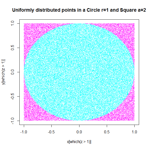
First let's see where all the randomly generated (x,y) co-ordinates
with a value greater than 1 for the function x^2+y^2 go in the plot. As
you can clearly see, all the points in magenta have fallen outside the circle, this
means that if you plot the other points in cyan they will all be inside the
circle. So our uniformly distributed points have more or less fallen
into shapes proportional to their respective areas. Now if we take the
ratio of the number of points to have fallen within the circle and
within the square (that is the total number of points generated) and
multiply this number by 4 we will get an approximation of the value of
pi.
So this gets you motivated for the next part which is simple and where we obtain an estimate of pi using simply the ratio of the counts of these points. This value of pi is close but it isn't exactly pi (3.1415926), which means that our measure of pi has some uncertainty, so we go about trying to quantify this uncertainty, since what we did was a stochastic simulation we need to perform more runs of the same simulation so that we get an estimate of how much does the value of pi oscillate around the real value.
length(which(z<=1.0000000))/length(z))*4.0000000
[1] 3.14112
Now we repeat this process say 1000 times and we store the value of
pi obtained for each iteration in a vector. After the 1000 runs are
over, we look at the distribution of the value of pi over the course of
1000 runs. So now the error in measurement is the standard deviation of the distribution of pi. You can see in the histogram styled density plot that the mean value of the density which is the peak, coincides with the point on the x-axis where the real value of pi must be. This concept is similar to how you estimate a statistic like the Standard Error of Mean (SEM), so you repeatedly take values of the statistic by random sub-sampling, then the distribution of the sub-sampled statistics gives you the standard deviation of the statistic which if it turns out to be the mean is called SEM.
# The mean value of this distribution of "pi-es" will be the value that is closest to pi
 plot(density(pi),col="red",type="h")
mean(pi)
3.141579 # which is pretty close to the real value
> sd(pi)
[1] 0.001547173

# is the measure of our error in the sampling statistic that we used to estimate the value of pi, we can improve the estimate of the value of pi by increasing both the number of points used as darts in the simulation and also the number of iterations for which we repeat the complete process.
"Pascal-Emmanuel Gobry writes at The Week, "If you ask most people what science is, they will give you an answer that looks a lot like Aristotelian 'science' — i.e., the exact opposite of what modern science actually is.
Capital-S Science is the pursuit of capital-T Truth. And science is something that cannot possibly be understood by mere mortals. It delivers wonders. It has high priests. It has an ideology that must be obeyed. This leads us astray. Countless academic disciplines have been wrecked by professors' urges to look 'more scientific' by, like a cargo cult, adopting the externals of Baconian science (math, impenetrable jargon, peer-reviewed journals) without the substance and hoping it will produce better knowledge.
This is how you get people asserting that 'science' commands this or that public policy decision, even though with very few exceptions, almost none of the policy options we as a polity have have been tested through experiment (or can be). People think that a study that uses statistical wizardry to show correlations between two things is 'scientific' because it uses high school math and was done by someone in a university building, except that, correctly speaking, it is not.
This is how you get the phenomenon ... thinking science has made God irrelevant, even though, by definition, religion concerns the ultimate causes of things and, again, by definition, science cannot tell you about them. ... It also means that for all our bleating about 'science' we live in an astonishingly unscientific and anti-scientific society. We have plenty of anti-science people, but most of our 'pro-science' people are really pro-magic (and therefore anti-science). "
END of Article
At least for now, this holds true, the deluge of jargon in a publication is quite unwarranted, in my humble opinion. However, we are in a vicious cycle that starts with papers getting rejected because they are too "easy to understand" or are doing "simple experiments" that a 12 year old could do. The reviewers think that if it is too simple then it doesn't behoove them to publish it in their journal, "what is the big deal?" they ask.
The question of "what is the big deal?" gets answered by academics in the form of massive amounts of data generated from high-throughput experiments using expensive and cutting edge equipment followed by an application of every form of statistical testing procedure known to man. If there isn't a hypothesis then we'll let machine learning algorithms loose on the data. Something will have to bunch up, cluster or have significance somewhere. We can make up the story after we have the results in front of us.
Why do we do it? because everyone else is doing it and we won't get publications and the grants that follow them if we don't do what "everyone else is doing".
What does this lead to eventually? A flood, thousands of papers buried under thousand others. Filled with jargon, complex mathematical notation, statistical tests that were probably cherry-picked because they gave the answers that were what the investigators wanted.
Finally, you the science newbie has to enter this world, you pick a topic and are rewarded with a deluge of papers. How does one get around to reading all of this? A FeedReader helps, but only in aggregating papers from topics that you would like to read. They still have to be read by you, understood, comprehended and the methods have to be tried out to see if they work.
Then you stumble upon all the limitations of the published method when you start to work on it. It will be quite some time before you realize that the best stories that could be told using the method are already published and that you are looking at the dregs. It's too late to back out, you've spent a considerable amount of time trying to understand it and get it working and you can't abandon all the work just like that. You try to mix and match different things to see if something comes, anything at all. Your desperation colours your perception and you attempt to justify any result by bending your "unbending scientific principles". Then it becomes an exercise in torturing the data with statistical tests until you get the answer that you want, even a hint of it supported by a P-value cut-off that you chose after the the application of the statistical test and the P-values came. Then you try to wrap it up into a story and get it published.
Why bother? I don't know...maybe because we have nothing better to do.
This very long post deals with establishing the significance of your correlation. In other words, the correlation that you report, is it just a random correlation that came up or is it truly representing a linear relationship. Ideas of permutation testing and analytical ways to obtain P-values are discussed. Some simulations are shown for an appreciation of the ability of randomness to generate patterns.
TLDR-over
We've discussed the theory of correlation at length in the Nuts and Bolts post and the scientific philosophy of correlation in the Philosophy and Practicality posts. Correlation is a corner-stone method in the sciences for the detection of statistical association between two variables in an experimental study.
One thing you should very firmly hammer into your own head is that when we talk about correlation we are not talking about causality, there is absolutely no way to establish causality using correlation. When you say that two phenomena A and B are correlated you can't say that A causes B or vice-versa. You can only hypothesize that there is an association between the two phenomena, which may be a direct or indirect association, you can't know which unless you have direct evidence.
For example, you can detect a correlation between green-house gas emission levels from automobiles and the global temperature increase. Therefore you may hypothesize that there is a contribution to global warming from increased vehicular CO2 emissions. However, precisely because you can only hypothesize and can't completely prove that CO2 emissions is the only factor contributing to global warming, people are not going to believe that global warming is real.
You could probably also detect a correlation between the average number of natural disasters over a time window and global temperature change within the window. When I say natural disasters, I mean the climactic variety like hurricanes, heat waves, cold spells, flash flood rains and unexpected weather for certain places for that particular time. However, using correlation, you still can't absolutely prove that these disasters are caused by global warming, as much as you would like to say it definitively.
Also besides being unable to prove that global warming is causing all of that, correlation is also unable to prove if the relationship between global temperature rise and CO2 is a direct relationship. For example, I can say that the increased greenhouse effect and concomitant temperature rise is because of methane (a more potent greenhouse gas) being farted out by livestock, the production of which has increased to sustain the ever-growing population of meat-eaters. Now I could say that the increasing CO2 levels are just a consequence of the respiration of the increasing population and livestock and meat and feed processing technologies that consume fossil fuels therefore the correlation we observe between methane levels and global temperature is more correct and explains global warming better.
Also consider a scenario where the increased CO2 levels lead to an increase in photosynthesis and therefore an increase in the total available plant biomass for animal feeding. Consequently the population of animals grow and feed more on the plants and fart out even more methane. So the methane levels increase because of increase in CO2 and this results in increase in global warming.
Now in such a case, even though you may find a correlation between CO2 levels and global temperatures, your inference that the increase in global temperatures is because of the greenhouse effect of CO2 will not be correct because that isn't the case. Increased CO2 leads to increased plant biomass which leads to increased animal feeding and concomitant population growth and the feeding of the population generated methane which being a more potent greenhouse gas lead to global temperature increase. This is a problem of transitivity, where you cannot ascertain and differentiate using the correlation metric between direct and indirect associations. Even if your variables are working in a sequential manner to cause a particular phenomenon, applying correlation between variables will show all the variables as being highly inter-correlated.
So you can see that trying to prove a hypothesis using correlation is a dicey business, you cannot prove anything. You can only postulate an association or rather a hypothesis.
So given two sets of observations A and B, under the classical hypothesis testing format, you formulate the null hypothesis thus. You state that A and B don't have any association between them. Then you calculate the correlation between them. Although you don't know if this is a direct correlation; as in, is the situation such that A directly
influences B or A acts through X which then acts on Y which then exerts
an effect on B (transitivity).
After you've calculated the correlation you need to determine if the number that you got is significant or not. That is done using a P-value derived using a Permutation Testing procedure. Now you say that under (significance level) you reject the null hypothesis (that there is no correlation) and accept the alternative hypothesis that there is a correlation.
The Permutation Testing procedure is used in many contexts to establish the significance of a statistic. I'm not really sure why, but I think when a statistic does not have an analytic formula that describes it, then the Permutation test is used to establish a significance level. For other statistics such as the T-statistic which is analytically tractable, it is normally done using the Area Under the Curve (AUC) for the T-distribution in the case of the T-statistic and other distributions in case of other statistics.
So the Permutation procedure at the very basic level relies on permuting the data points on which the statistics have been calculated. Then it recalculates the statistics for this permuted, jumbled and by now non-sense data, The newly calculated statistics (often referred to as a null distribution) are then compared to the values with the statistics for the original non-permuted data. A P-value estimate (I don't know if calling it a P-value would be correct because at some places that I have read, this method is also used in calculating the False Discovery Rate, but then we're talking about the limits of what I know, I would happily be corrected in the comments) is then made by calculating the number of times the statistic of the randomized data went higher than that of the original data. This divided by the number of permutations gives you an estimate of the so called P-value.
Thus the Permutation test is used to calculate the significance of statistics. For correlation, the Permutation test tells you how likely it is that you got a such a nice correlation by chance. The advantage of having a significance level is (if you go by Ben Lehner's papers themed on stochasticity and noise in biological systems) that you can detect very weak correlations, which in the standard statistical methodology would have been ignored, because a correlation like 0.10 is considered insignificant in magnitude. In biology, apparently 0.6 is considered a ball-park value for a good correlation. For very weak correlations in Lehners' papers however, when you calculate the P-value for that low correlation, it turns out to be 10^-28 (10 power negative 28) or some very low value like that which makes that tiny correlation significant. Which means that the chance that you got such a weak correlation by accident is 1 in 10^-28.
So how would you pick up a weak correlation or maybe prove that a strong correlation that you got is not by chance. You can use a simple code to permute the values of a variable, to take an example which is meaningful in biological sciences, the correlation between a small number or set of values.
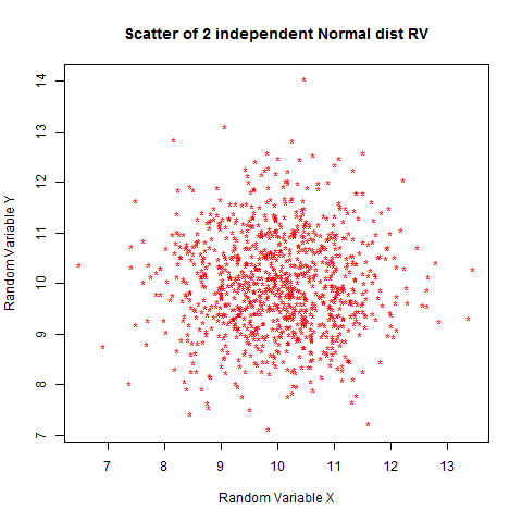
To make the plot thicker, let's examine the phenomenon of "spurious correlation". This is a correlation that appears when you take ratios of numbers to calculate correlation. An example of that would be the popular strategy of taking the log ratios in micro-array data analysis to calculate fold change or in the field of yeast synthetic genetics, taking a ratio of the growth rate of the mutant strain to the wild-type to examine fitness changes caused by mutation. When you measure ratios and use ratios to find correlations, you will find correlations that are actually artifact correlations that are generated because you took the ratio. When using correlations you must use the raw values to see if there are correlations and not the fold-changes.
cor(x,y) # gives a weak correlation -0.0050
plot(x,y,pch="*",main="Scatter of 2 independent Normal dist RV",col="red",xlab="Random Variable X",ylab="Random Variable Y")
cor(x,y/x) # gives a strong negative correlation of -0.717
plot(x,y/x,pch="*",main="Scatter of RV X and Y/x",col="purple",xlab="Random Variable X",ylab="Y/x")
It is easy to see why this would happen. As x changes, the value of y/x
is locked on to the change. An increase in x causes a decrease in y/x
and a decrease in x causes an increase in y. They are actually related
by the straight line equation where (y prime) is a ratio the value of
which depends on the value of y as well as x. So y' = y*(1/x) and gives a
nice negative correlation.
cor(x/z,y/z) # gives a relatively strong correlation of 0.4874412
plot(x/z,y/z,pch="*",main="Scatter of RV X/z and Y/z",col="purple",xlab="Ratio X/Z",ylab="Y/Z")
It is also easy to see how this would happen. Z is a normal random variate and whenever Z is a high value, x/z and y/z will become low and when Z is a low value x/z and y/x become high, thus introducing a positive correlation.
You can also see the effect of dividing both variables by the same set of random normal numbers. Dividing them by the same set of numbers gives you a positive correlation which is relatively strong (0.48). So you can see why taking ratios can be a problem. In biology it is a relatively common practice to divide by the total or by a particular variable. This can lead to incorrect conclusions being drawn of correlations that exist when they are actually not there and have been introduced erroneously by the normalization procedure.
Now does a permutation test prove that this correlation is not significant? Not really, since it is actually a proper correlation caused by a mathematical relation. However we can try to see how the permutation testing procedure tests for significance of correlations by testing it out on some simulated data. To ensure that the simulated data is truly random, we will generate the data using random numbers from a uniform distribution and write a program that selects a randomized set that passes the correlation criteria.
Let us try an exercise where we first make a program that tries to randomly generate data of a certain correlation that we demand from it for a specified amount of numbers. Basically we want to feed in the correlation value say 0.6 and need 10 numbers which when used to calculate correlation against 1 to 10 should give us a correlation of 0.6.
this function does precisely that. It takes a correlation value as an argument along with the length of the vector to be generated and then attempts to generate as many sets of random uniformly distributed numbers until it finds a set which exhibits the correlation that we've given as the argument. It returns the numbers that it has found along with the number of trials it took to get that set from random number draws as a list.
It isn't too hard to see by hand but you can easily see that as the length of the vector requested increases, the number of iterations taken to get to a vector that satisfies that particular value of correlation increases.
Now as another fun exercise, let us try to increase the vector length from 5 to 60 in steps of 5 (12 steps/iterations) keeping the correlation value at 0.6 and repeatedly calculate the number of random number draws that were required to get that correlation for a given length of the vector. Following that, we will plot a box plot of the number of iterations to see how much of a an effect does chance play in getting that correlation. For shorter vectors it is possible that the spread of iteration count values will be small since it is easy to stumble upon that much correlation by chance but for bigger vectors the spread should be quite large since it could take a lot of time to get that high a correlation randomly.
Now, I've written some quick and dirty code to do this that takes about half an hour to execute on an Intel Core 2 Duo, 2.1GHz, 4GB RAM Windows machine running RStudio on Windows 7. Most of the half hour is spent on the later part where high correlations have to be discovered in larger sets of numbers and therefore more iterations are needed.
corlenseq<-seq(5,60,by=5) corlist<-vector(mode="list",length=12) for(i in 1:12) { for(j in 1:50) { corlist[[i]]<-c(corlist[[i]],cor_RandGen(cor_val=0.6,len=corlenseq[i])$trial) } print(i) } uncorlist<-unlist(corlist) matuncor<-matrix(uncorlist,12,50,byrow=TRUE) boxplot(t(matuncor),col="purple",main="Iteration count for random hits of 0.6 correlation for set length 5-60 in steps of 5")
The plot in log scale looks a little better, you can see the monotonic increase in the median value of the iterations required to reach the same correlation as the set element numbers keep increasing.
I dare say that the median value of the number of iterations increases exponentially and therefore a log scaling could give a nice linear fit for the medians.
plot(corlenseq,ylist,main="Scatterplot of log2 median iterations vs. sequence length Correlation: 0.6",col="red",xlab="Sequence length",ylab="Log 2 Median iterations")
We can try a regression on log transformed medians. If the model fits well then we can presume that the log transform linearizes the medians. Now if a distribution becomes linear on log transformation then it was probably exponentially distributed to begin with, in which case we could say that the median value of the number of iterations it took to discover a vector (generated from a uniform distribution) that had a correlation of 0.6 was exponentially distributed with relation to increasing length of the vector.
Now to fit a linear model to the data, we take the y vector as the log transform of the median values of the distribution of the number of iterations taken to get a vector with that high a correlation (0.6) as the length of the random vector increased from 5 to 60 in steps of 5. The distribution of number of iterations is obtained by repeating the generation of a random vector of a particular length 50 times. The x vector is simply the lengths of the sequence of the random vector from 5 to 60 (corlenseq).
Residual standard error: 0.1845 on 10 degrees of freedom Multiple R-squared: 0.9969, Adjusted R-squared: 0.9966 F-statistic: 3180 on 1 and 10 DF, p-value: 7.456e-14
-------------------------------------------------------------------------------------------------------------------------------
So the R-squared comes to be around 0.99 so we can safely say that the time taken to generate a sequence of a particular correlation from a uniform distribution is exponentially distributed with respect to the length of the sequence. The slope of the line-fit is 0.253 and the intercept on the x-axis is 1.904. The P-value obtained from the correlation/regression - 7.456e-14 indicates that this is highly significant.
Now that is a cool thing that even I did not know. That the median time taken to find a sequence of a particular correlation randomly, varies as an exponential function of the length of the sequence.
Okay so now the post has started to acquire a mind of its own. Anyway, back to business, the post is still about establishing significance levels of correlation using permutation testing and that is exactly what we are going to do with a randomly generated vector of a certain correlation.
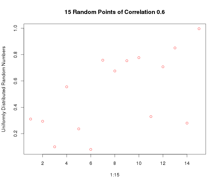
So we generate a vector of length 15 that has a correlation of 0.6 using our random correlation sequence generator. Then we'll permute the values to see how significant do we get the correlation to be.
plot(xvar,randcor0p6$y_var,main="15 Random Points of Correlation 0.6",col="red",xlab="1:15",ylab="Uniformly Distributed Random Numbers")
We can find a P-value for the correlation using R by using the cor.test function instead of plain ol' "cor". Note that the P-value given by cor.test is the same as the one given by the linear model fitting summary above.
Call:
 lm(formula = randcor0p6$y_var ~ xvar)

Residuals:
 Min        1Q    Median     3Q     Max
-0.46377 -0.19194 0.06573 0.19094 0.28212

Coefficients:
            Estimate Std. Error  t value Pr(>|t|)
(Intercept) 0.20685  0.13475     1.535   0.1487
xvar        0.03836  0.01482     2.588   0.0225 *
 ---
 Signif. codes: 0 ‘***’ 0.001 ‘**’ 0.01 ‘*’ 0.05 ‘.’ 0.1 ‘ ’ 1

Residual standard error: 0.248 on 13 degrees of freedom
Multiple R-squared: 0.3401, Adjusted R-squared: 0.2893
F-statistic: 6.7 on 1 and 13 DF, p-value: 0.0225
--------------------------------------------------------------------------
Now we should try to see if we can write our own variant of a permutation testing function and see if it gives P-values anywhere close to the in-built routines in R.
So we will write a quick and dirty code that permutes the values of y vector and then calculates correlation of x vector against permutations of y vector. The number of times the correlation is higher than the correlation of the un-permuted data divided by the total number of permutations is considered to pass for the P-value.
This takes about 2 minutes to execute on an 8GB,quad-core Xeon machine, (Dell Precision T5400)
cor_rand<-vector() for(i in 1:100000){ cor_rand<-c(cor_rand,cor(xvar,sample(randcor0pINR371y_var))) }
# P-value as defined as how I've seen it done for permutation testing. length(which(cor_rand>cor(xvar,randcor0pINR371y_var)))/length(cor_rand) [1] 0.01186
Hmm, interestingly, this seems to be an underestimate of the P-value compared to what we obtain from the regression/correlation tests which both seem to be using the same algorithm to estimate P-value. Could it be that the tests are obtaining the P-value by some other means? We could try building the distribution of the permuted P-values, which follow the T-distribution as I've heard and then try a rough numerical integration to see how much of the Area Under the Curve is covered until correlation of 0.6 is reached. Note that this is highly experimental and possibly wrong but then in a random blog we could try it out and learn something new, wrong things lead away to right things, eventually...
Using a density approximation, we can get a smoothed histogram. The object returned by using the density command is a list containing x and y values.
So now, I will use the trapezium rule for integration to find the area under the curve for the density curve of the randomized correlations obtained from permutation of the original data. That is 0.5 * sum of parallel sides * height, the height here is the successive difference as we step through the x-axis calculated using the R function diff which gives back a vector containing the successive differences. The sum of parallel sides is done by successive sums looping through the y-axis and adding the i and (i+1) element together until you reach the end of the y-axis and concatenating the results in a vector. plot(density(cor_rand)) dens_cor<-density(cor_rand)
height<-diff(dens_cor$x) sops<-vector() for(i in 1:(length(dens_cor$y)-1)) { sops<-c(sops,sum(dens_cor$y[c(i,i+1)])) } # Finally you just multiply the vector of differences with the vector of the successive sums and take the sum of the resultant vector and multiply it by 0.5, you should ideally get the complete area under the curve which should sum to 1 and maybe a little more because of numerical errors in the rounding off procedure. sum(sops*height)*0.5 # [1] 1.000978
# That is pretty close to 1, and now we need to find out what the area under the curve is when we integrate till the correlation of 0.58. So that would mean taking the area under the curve till 0.58. length(which(dens_cor$x<=0.58))# [1] 408 #Now the area under the curve until correlation of 0.58 is the area of the trapeziums formed by those sides till 408. sum(0.5*sops[1:408]*height[1:408]) # [1] 0.9886911
#Now the P-value is 1-AUC until the value till index 408
Um, well as it turns out, this P-value is also not close to the P-value we found using the regression/correlation in R and in fact it is closer to the P-value that we found using the Permutation testing procedure ( 0.01186). So I think we may be barking up the wrong tree here. Anyway, looking up on how R gets the P-value for its correlation I found something about a transformation called the Fisher's Z- transform. It seems that the correlation values that we get from the sampling distribution are not normally distributed except for low values of correlation and tend to be negatively skewed for higher values and applying this transformation mitigates the skewing problem.
The transformation is:
Now to do all of that neatly, we need cook up some functions, one for the
Fisher's Z transform and the second for the Trapezium integration.
A fairly simple function for the Fisher's Z-transform
For the trapezium integration, I've
just put together the code from the earlier integration code into a
function into which you can pass the randomized correlation distribution
and the threshold of correlation till which you want the AUC to be
calculated.
Now we could try applying this transform to our permuted correlation co-efficient and see if it brings the distribution to a normal distribution (trivia: such transforms are called variance stabilizing transforms). So we'll try the same thing we did earlier, i.e we start with the distribution of correlation co-efficients obtained from our permutation (cor_rand) and this time we run the Fisher's Z transform on those values and using these transformed values to estimate the Area Under the Curve again using the Trapezium rule and consequently find the P-value.
ZtranCor<-FisherZ(cor_rand)
Lets try plotting the histograms to see how things change with the transform and then we'll do an over-plotted density plot to see how the overlap is, without the R pretty printing graphs to mislead us how different the histograms look.
hist(cor_rand,col="yellow",main="Permuted Random Correlations",xlab="Correlation") hist(ZtranCor,col="purple",main="Fisher-Z-transformed Correlations",xlab="Correlation")
You have to admit though, the Z-transform has clearly made the histogram much more symmetrical
plot(density(ZtranCor),col="purple",type="l",lty=2,main="Permuted Correlations (PC's) and Z-transformed PC's density")
lines(density(cor_rand),col="red",type="l",lty=3)
So applying the transform and looking at the density plot we can see that the red curve which was the original permuted correlation distribution of values is slightly asymmetrical around the center while the purple curve which is the Fisher Z-transformed value has more or less symmetrically distributed itself around the center.
So now we execute this function TrpzInteg_AUC on the Z tranformed permuted correlation distribution values (ZtranCor to find the estimate of the P-value according to the same principle as we did before.
TrpzInteg_AUC(cor_rand,0.58) # Total AUC 1.00097847575004 # [1] 0.9886911
1-TrpzInteg_AUC(cor_rand,0.58) # Total AUC 1.00097847575004 # [1] 0.01130888
1-TrpzInteg_AUC(ZtranCor,0.58) # Total AUC 1.00097114802702 # [1] 0.02189813
So as you can see, the function behaves correctly as evidenced from it giving the same value for the non-transformed data as we calculated earlier.
The P-value estimate for the Z transformed correlation distribution(0.0219) is closer to the P-value obtained from the regression/correlation (0.0225). So we can probably say that the correlation/regression function in R uses a similar and definitely more accurate method (for the numerical integration) to give us the estimate of the P-value that it does. I'm not implying any warranties here that what we did was correct but then I could say that it was not entirely wrong.
However, the main objective of this post is not yet over, whilst we have shown how the P-values are obtained and it was a good exercise and everything, we still haven't shown the difference in the significance levels of correlation between a randomly generated vector and a real data vector that has noise added into it keeping the correlation at 0.6.
So as it turns out (proof not given). A high correlation such as 0.6 generated even through random means has just as much P-value as a perfect correlation that has been noised to 0.6. This means that a correlation of 0.6 for a vector of length 15, if it has that high a correlation, holds significance by virtue of its length. The blog post on Correlation: Philosophy and Practicality has an interesting graph which shows the decline of a perfect correlation as exponentially distributed noise is added to it. For correlations till 0.6 you can see the "cloud around the diagonal" but then as the correlation drops lower, you don't see the cloud anymore for correlations of say 0.2. At that point it pretty much looks randomized and that is where the P-value estimates are going to come in real handy. Proving that is going to take some more coding and I think this post has stretched far too long. Another post on another day, probably part 2 will have the simulations for that.